Lynda
What I mostly took from the first video was the color scales and their differences (RGB versus CMYK), which colors to pick for a project, and how to make colors compliment each other. I am looking forward to creating logos, or designs in general, for people/businesses and putting my newfound knowledge of colors to use in making an color-aesthetically pleasing design.
The second video was teeming with frustration-calming and idea-forming ideas. From the analogy on the original Freedom Tower to the 80/20 principle. I was shocked by the accuracy of the 80/20 rule. At first I couldn’t fathom that the rule applied not only to human related things but to other animals and even plants as well.
Illustrator- Color Wheel
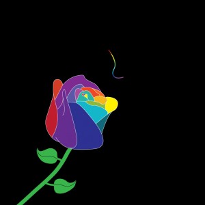
I started physically forming the idea of my color wheel project on Friday. I wanted to try something that would push me out of my comfort zone, so I tried drawing. I didn’t want to bite off more than I could chew so I decided to take the simplistic approach. The first thing that came to my mind when hearing I had to make a color wheel out of something was a flower, a tulip specifically, with different colored petals. While the idea I had in my head would require some illustrator, it was really photoshop heavy and I don’t have the drawing capability for hyper realism. I tried to reconstruct the picture in my head using solely illustrator but the vibrance of colors was low and the tulip didn’t even look like a flower anymore. Looking at the product I concluded that the problem wasn’t my skill in drawing but it was the flower. A tulip simply did not have enough surface area on its petals to give the variety of colors I was looking to include. I took a break and focused on the Lynda videos where I learned about the 80/20 rule. I decided to try and make my flower take up 20% of the space on the page and leave the other 80% untouched to see if it gave an aesthetically pleasing look that was all in the subconscious. Instead of dropping the project all together I decided to fix my issue and search for a flower that had more surface space on its petals. I ended up settling on a rose. I outlined a rose and used the illustrator tools to smoothen it out. I created another layer below the outline and used it to color the petals in. After finishing the flower I wanted to add a nose smelling the flower but couldn’t make the line into multiple colors. So I used shapes to create a frame around a line I made in the shape of a nose and put a photo of the color spectrum behind it before trimming it leaving only a little bit of the photo left but in the shape of a simplistic nose.